By Cristina Verán
Posters are among the most egalitarian forms of visual communication—second only to graffiti and street art perhaps—offering immediate aesthetic impact alongside urgency of message. Beyond compelling our gaze, they serve as potent public instruments to elevate ideas, broadcast political demands, promote cultural values, and disrupt official narratives. Yet, due to their ephemeral nature and vulnerability to the elements, traditional museum spaces devoted to fine arts have historically struggled to understand how to value them or where they belong within formal canons. In “Designed to Be Red: Native American and Indigenous Poster Works” at Poster House Museum in New York, curator and graphic designer Brian Johnson (Monacan) affirmatively places this erstwhile transitory medium at the center of contemporary Indigenous visual culture and critical design history.
The project emerged from a multi-year effort to rethink and rebuild the museum’s holdings—shifting away from an archive previously dominated by non-Native commercial imaginaries toward one generated by and for Indigenous audiences. To that end, Johnson pointedly challenges standard ink-on-paper assumptions, broadening the definition of a poster to encompass traditional systems of visual communication and record-keeping, such as Haudenosaunee wampum belts and Navajo dye charts alongside printed broadsides.
To guide visitors through the space, Johnson arranges the works across porous, non-linear currents centered on themes such as Indigenous Joy, Creative Sovereignty, Resistance and Protest, and Extractive Marketing. By juxtaposing government propaganda and outsider myth-making against the power of self-determined Indigenous production, the exhibition establishes a dialogue where Native voices speak with an unassailable authority. The result is a space that is both critically sharp and profoundly celebratory of Indigenous creative sovereignty.
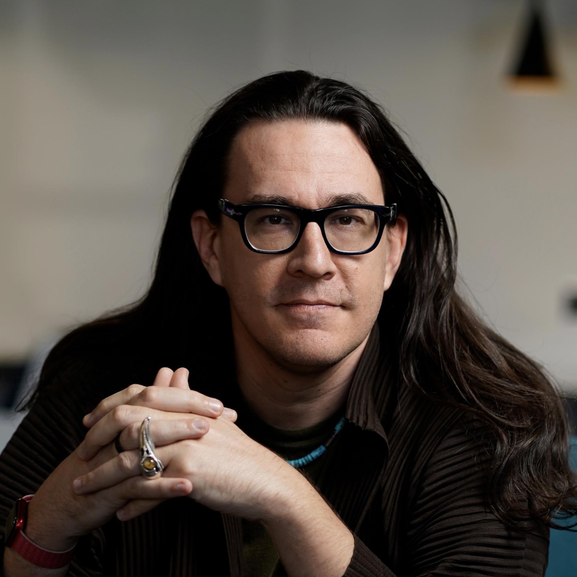
Brian Johnson. Photo by Christian Ulrich.
Cristina Verán: Let's start with your background—whatever you’d like to share about yourself, your community, and your work.
Brian Johnson: I'm an enrolled member of the Monacan Indian Nation, whose ancestral lands—where I grew up—are in Central Virginia. In addition to being the curator of this exhibition, I'm also the author of the book that goes along with it, "Designed to Be Red: Native American and Indigenous Graphic Works."
CV: Beyond the singular assemblage of such important works of contemporary design, what would you say is a central objective of this show?
BJ: What I hope this exhibition does is speak to this large conversation about collecting and using posters as a way of very quickly disseminating information and calling something to action. I'm turning and looking at graphic works and graphic design history, trying to push out or pull down some of the walls that have siloed art, craft, design, etc. within the creative sphere.
CV: How did you come to the curatorial field and to thinking in this way?
BJ: I came in the back door—as a practitioner. I graduated from Rhode Island School of Design (RISD) where, at that time, I wanted to be a bookmaker. Everyone else at RISD told me, "Just learn to code and do websites. That's where the money is." But I said, "No, I don't want to do that." Instead, I went back to some really old-school ideas, like, "Let's set type. Let's learn how to share information that way."
Silas Munro—my business partner in Polymode, the graphic design firm that we started together in 2014—and I didn't really see ourselves represented in the design histories being taught in the department. I didn't see any Native American history, and he really didn't see any that was African American. About 10 years after graduation, he reached out to say, "Hey, I have been asked to design a book for the MoMA about Jacob Lawrence’s Migration series. Would you want to work with me on this?" Of course I said, "Yes!"
This was the first moment for us to really collaborate, and it stuck! We stayed in the museum publishing world at the beginning, doing more books—for example, the one for the Willi Smith show at the Cooper Hewitt Museum. We also did the didactics and the signage system for it, and worked with the architecture firm to build out that space. From that, we started to get deeper into exhibition design—which includes the quandary of openness within an exhibition space. How do you walk someone through it? That's pretty much how I came to curation; being in the museum space for most of my professional career and understanding audience, accessibility, thematic, how things talk to each other across a room, space and time.
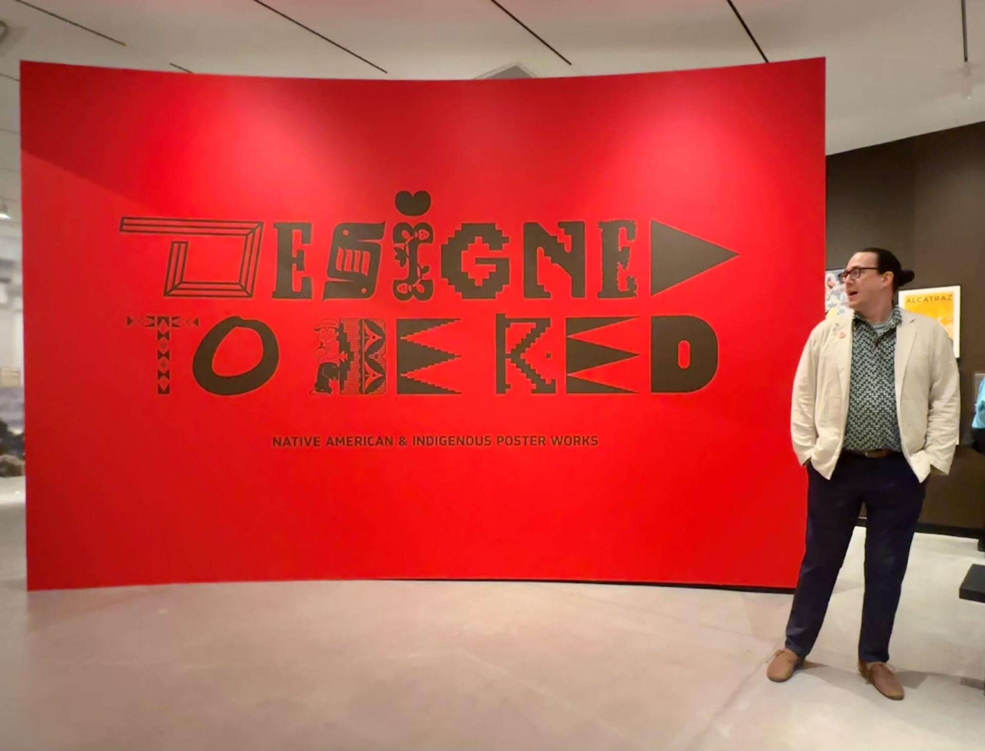
CV: Was there a pivotal moment that had you thinking particularly about the politics of exhibitions, in terms of what was missing re: Indigenous voices and images?
BJ: In 2020, the murder of George Floyd motivated Polymode to create BIPOC Design History, an online learning platform through which we could help to ensure that Peoples who have been erased, excluded, or left out of the design canon would be given their due; where we would talk about not only their histories but also their humanity. We saw the need for this because even in those places that we had come to feel safe in—yes, those “ivory towers” of Yale, RISD, Cranbrook, CalArts, and such—our Peoples were still not being seen and talked to. So we thought about, “How do we talk to people? How do we meet them where they're at? How do we educate the most harmed and give them space to feel safe?” That is what archives and museums should do, but aren’t necessarily doing.
CV: How did an interest in posters come to you? Was there a specific era or genre that grabbed your attention?
BJ: Posters are this discernible, contemporary way of sparking dialogue in the public sphere. A poster exists to make sure that people can see it, read it, and understand it. My interest started to pick up with learning about the whole Bauhaus movement, for example—what we're all trained in—as well as Art Deco works coming out of France, German posters from the 1920s. Then, of course, the Constructivists that came out of Russia around the [Bolshevik] revolution produced such beautiful poster work, instinctively understanding how to create an immediacy in their message giving—in a time when the power of the printing press was such that just owning one could get you killed. It's that tension and that history that so interests me.
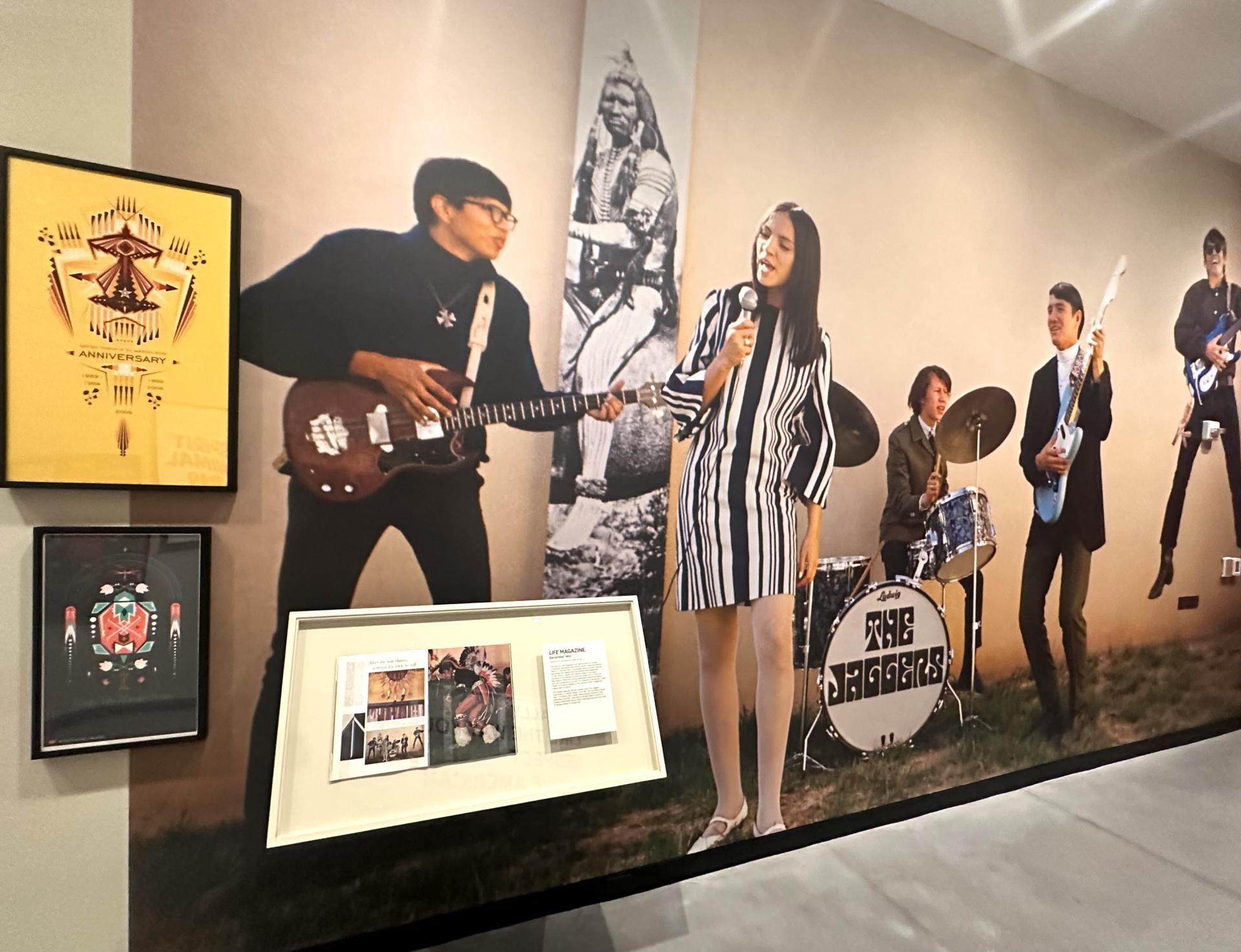
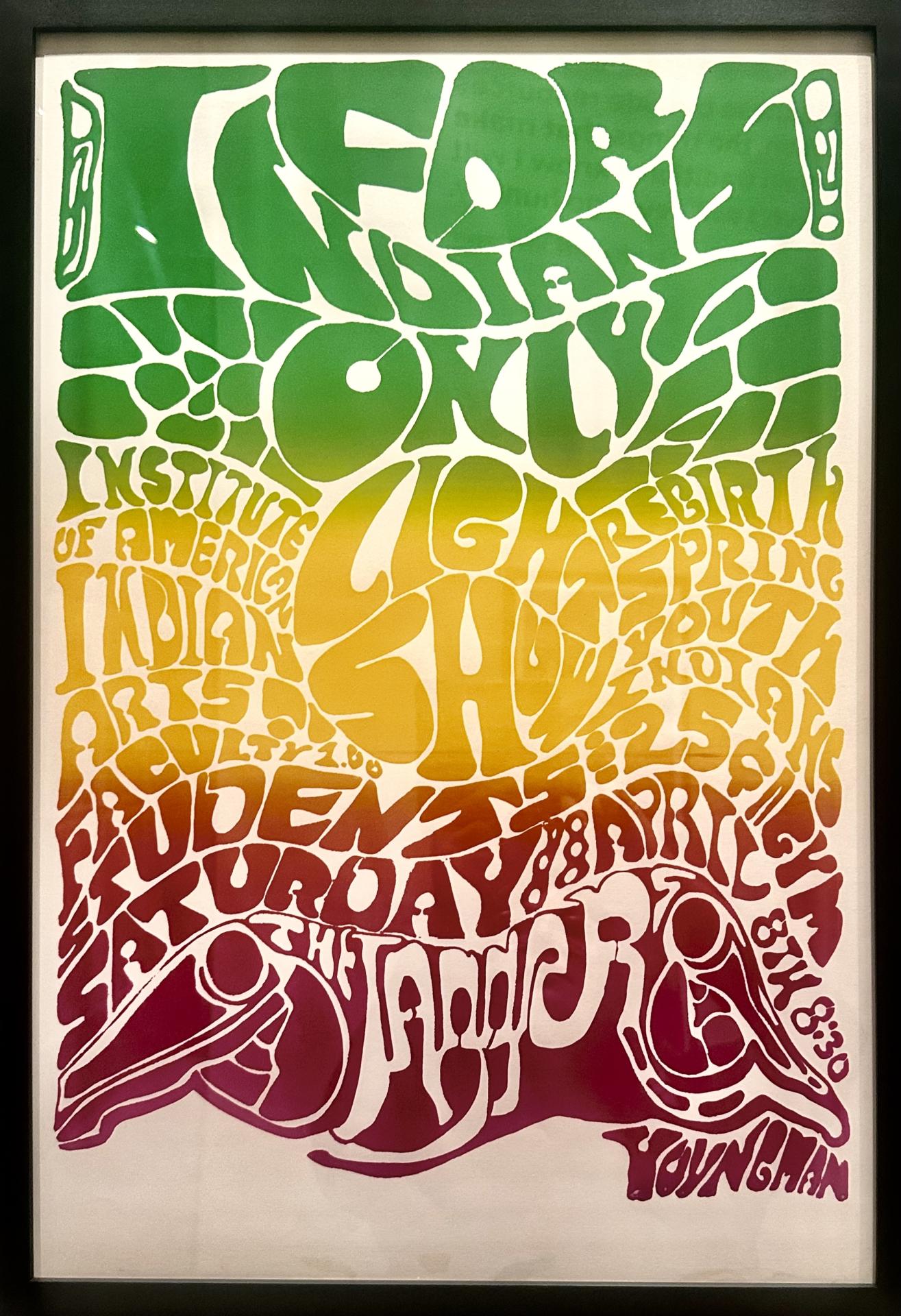
I was drawn also to the Arts and Crafts movement, and I really loved the sort of Americana pieces that came out of the pre- and post-World War II periods. Then from there, the Haight-Ashbury movement caught my eye; all the psychedelic posters that came out of the late ‘60s and early ‘70s.
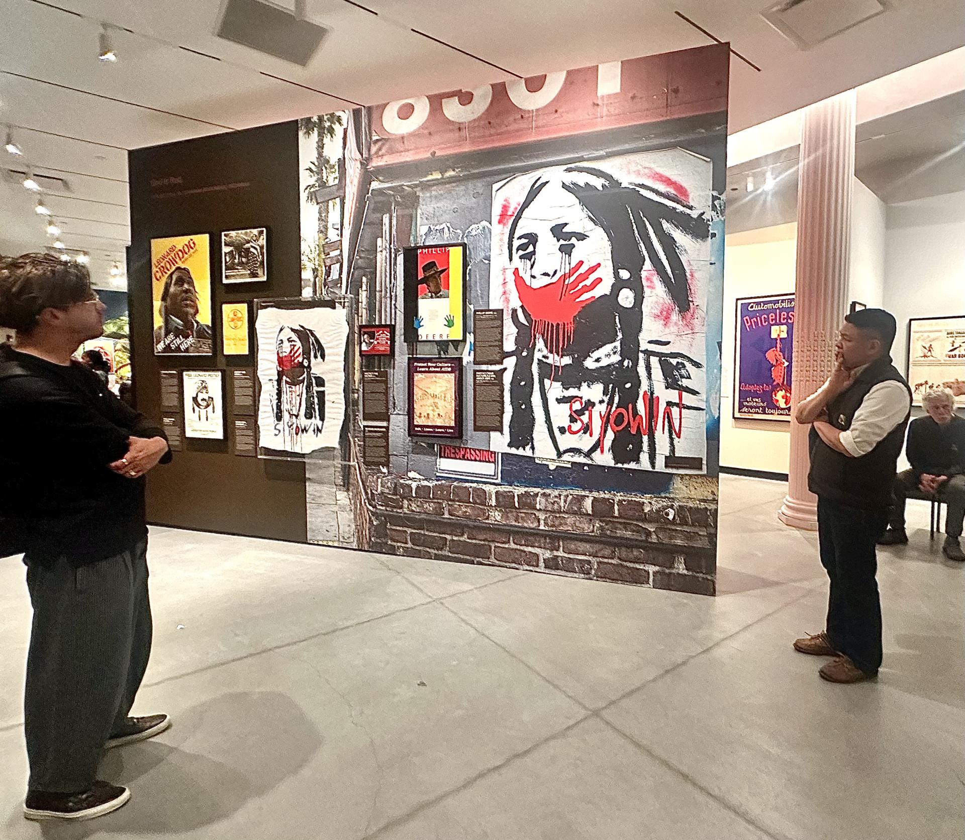
CV: The show contrasts works that Indigenous artists themselves intended for Indigenous audiences with others decidedly not-so; commercial ads and government propaganda, for example. Let's talk about the critical conversation these spark throughout the exhibit.
BJ: Well, the foundational “America” story is rooted in this mythos that, when the colonists showed up from Europe, the Indigenous Peoples already living here were some kind of uncivilized, primal, pagan natives that just needed to be “saved”; that there was no “high civilization” here before their arrival. At the same time, as they began to fashion themselves as “Americans,” they began to consider, “What is more American than these Natives?” They wanted to kill them, and then retell their story, putting themselves in that role, instead, taking on the vestiges of this Native identity.
Philip Deloria outlines this American mythos really well in his book "Playing Indian." When we think about the Boston Tea Party, for example, everyone in it—all European Americans—donned outfits to make themselves look like [their idea of] Native Americans, thus representing this ethos of the wild and untamed. By the time you get to President Andrew Jackson and things like the Indian Removal Act, the Trail of Tears, and what would become a perpetual genocide… all of the horror, the pain, and suffering they were causing… they had to keep the mythos going, which then became: "Look at this beautiful untouched land. There is nobody here!"
And sure, maybe when they went to this place or that they didn’t see anyone. But if, for example, a People live as migratory, transitory communities, following buffalo herds, sometimes they won’t be at that river; they’ll be upstream. For my ancestors that lived in what is now Virginia, they wouldn’t be close to the coast during hurricane season. They’d move their families further inland because it was safer. I wanted the show to consider how the U.S. government has told and trained the American people to believe in a very particular story.
CV: As posters became a tool to reinforce this mythos, did the U.S. government or commercial entities ever hire Native designers, or collaborate with them?
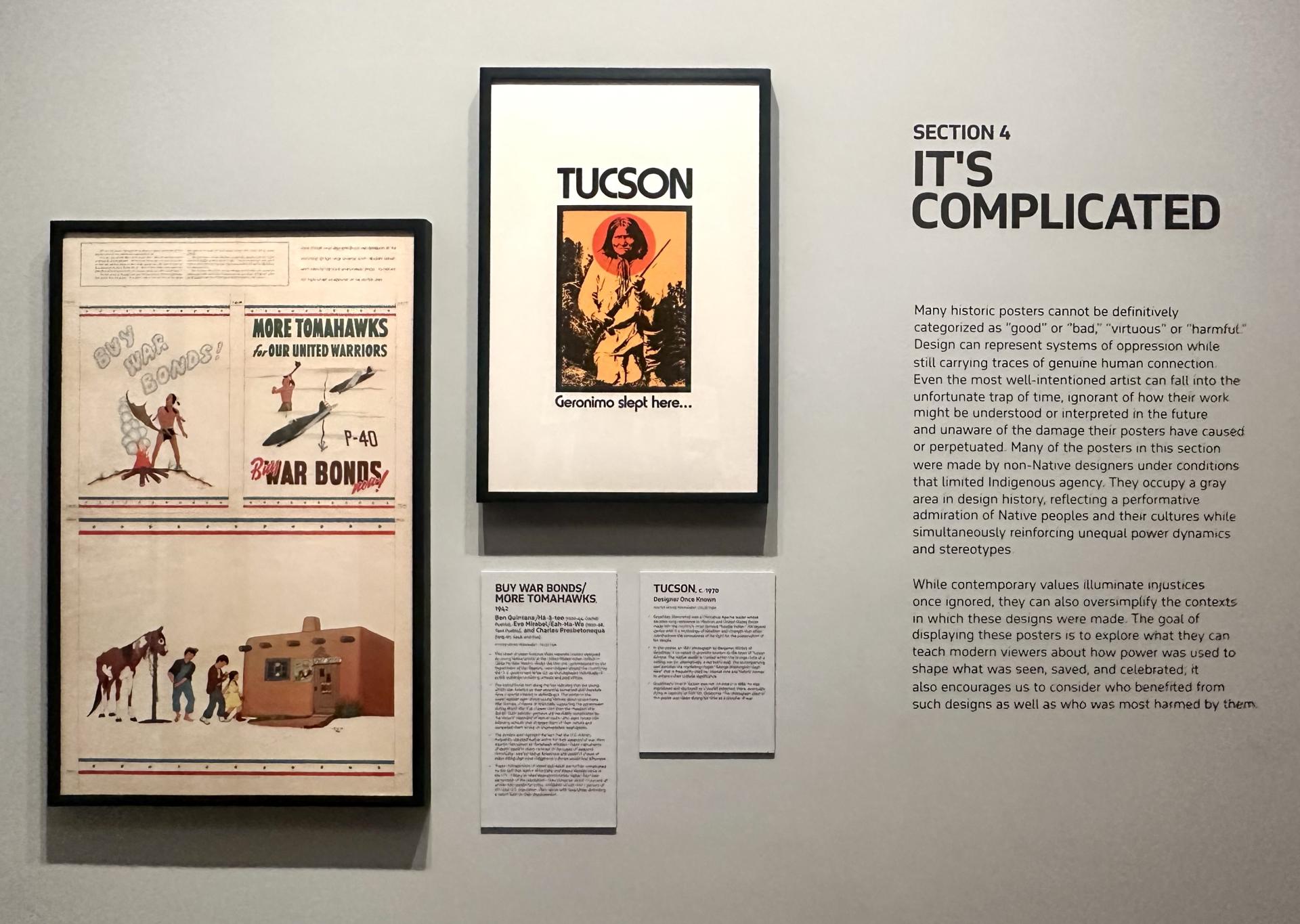
BJ: Hmm, yes and maybe. I’ve attributed, throughout the show, “designer once known” on some labels. To imagine, “Were there Natives making those things?” There might have been, certainly among some of the illustrators; a few young adults. But then, would that Native designer really want their name or lineage attached to what is ultimately something produced as an extraction of their own people? Could they recognize that extraction?
As for collaboration, I have no evidence, no documentation to show that they were ever asked. Sometimes we just don't know. But let’s talk about the section featuring posters showing those big powwows. It’s a white man, artist/publisher Louie Ewing, who made the litho- and silk-screened posters for these events, choosing to lift and separate Native artworks from their origins.
He seems to have thought of himself as honoring them, saying, "This was done in the style of Jim Redcorn.” But why didn’t Ewing just approach Mr. Redcorn directly and say, "Hey, would you collaborate with me and put your artwork on this poster?” Why did he never go and talk to those Native artists? He was living in the Southwest—in Santa Fe at the time—so why didn’t he just go and find some out in the Pueblos nearby? Or he could have gone to the Navajo reservation and said, "This year's posters will be Navajo-specific. Are there any designers or artists or weavers here who’d want to work with me on these posters?" But he did not.
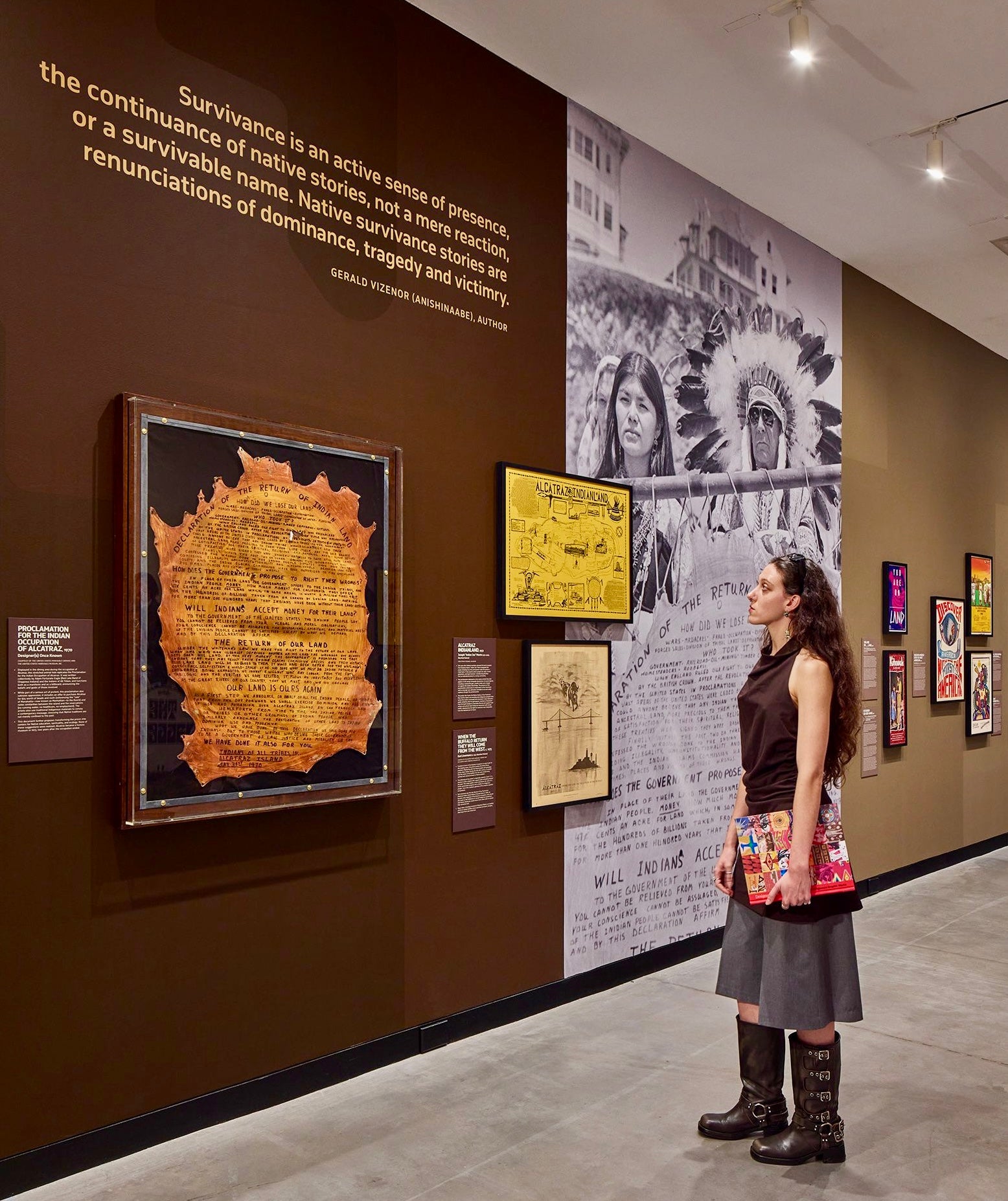
Photo by Samuel Morgan, courtesy of Poster House.
CV: The layout allows visitors to navigate the space from multiple angles. Was that intentional?
BJ: Indeed. I built it so that a person could walk through it in whatever way they choose. I wanted to also support neurodivergent visitors, who might prefer just to wander around looking at things in their own way. I was taught by the work of Dr. Dori Tunstall, the design anthropologist, to also consider: Who could be harmed by anything in that space? Was there anything that could make them feel triggered or oppressed? This meant I had to think about, say, a 14-year-old Native girl—one who has been through some type of trauma—and what her experience of things would be. Looking at what I was building through the lens of the most harmed, I did not want to focus only on the complications of racism and extractivism. I want to fill the viewers with joy and a feeling of the artists’ creative sovereignty and pride.
CV: How do the distinct thematic sections guide the viewer through the space?
BJ: Indigenous Joy is how it begins, and then moves onto Creative Sovereignty. After that, I bring things into the realm of Resistance and Protest. And then you move into It’s Complicated, and on to Extractive Marketing. It was very intentional how I directed that, as I wanted it to be from a Native standpoint. Natives know a fair amount of Native history, and they feel the genetic remembrances of everything that’s happened to them. We understand how to feel oppression, so the last thing I wanted to do was to pull Natives into a museum show and say, "You know what you ought to feel today? More oppression."
I wanted it, ultimately, to be very celebratory, very bright and inspiring—and, aesthetically speaking, quite densely colorful. I wanted a maximalist show, with things hanging everywhere, because that's the cacophony of life—not this white cube BS. That, for comparison, is how I present the Extractive Marketing section in the back. It has no color on the walls for a very distinct reason. Its white walls, like the white (American) culture, can stand in its own little reservation, you could say. But just as you walk out of that section, all the color and the joy and the sovereignty and the resistance are right there, once again, to meet you and to welcome you back into a kind of loving and familial sense and space. When I was working with Ola Baldych and the design team, my thought was: this isn’t going to be some linear, modernist line. It’s a snake eating its tail; it’s a web.
CV: Do you give structured audio tours, or do you prefer to tailor your curatorial walk-throughs dynamically?
BJ: I like to give each tour based on the vibe of the room in that particular moment. Like I could talk on and on about voting rights and creative sovereignty, or for another group, I might say, "Let's just talk about some really cool artists that are friends of mine,” Or, “Let's talk about what makes me want to get onto my computer and make new work." I’ll consider first whether I am talking to students, or to members of the museum that are of a certain age and just want to have their brains massaged.
CV: How did Poster House Museum initially approach you, and how did you build this collection together?
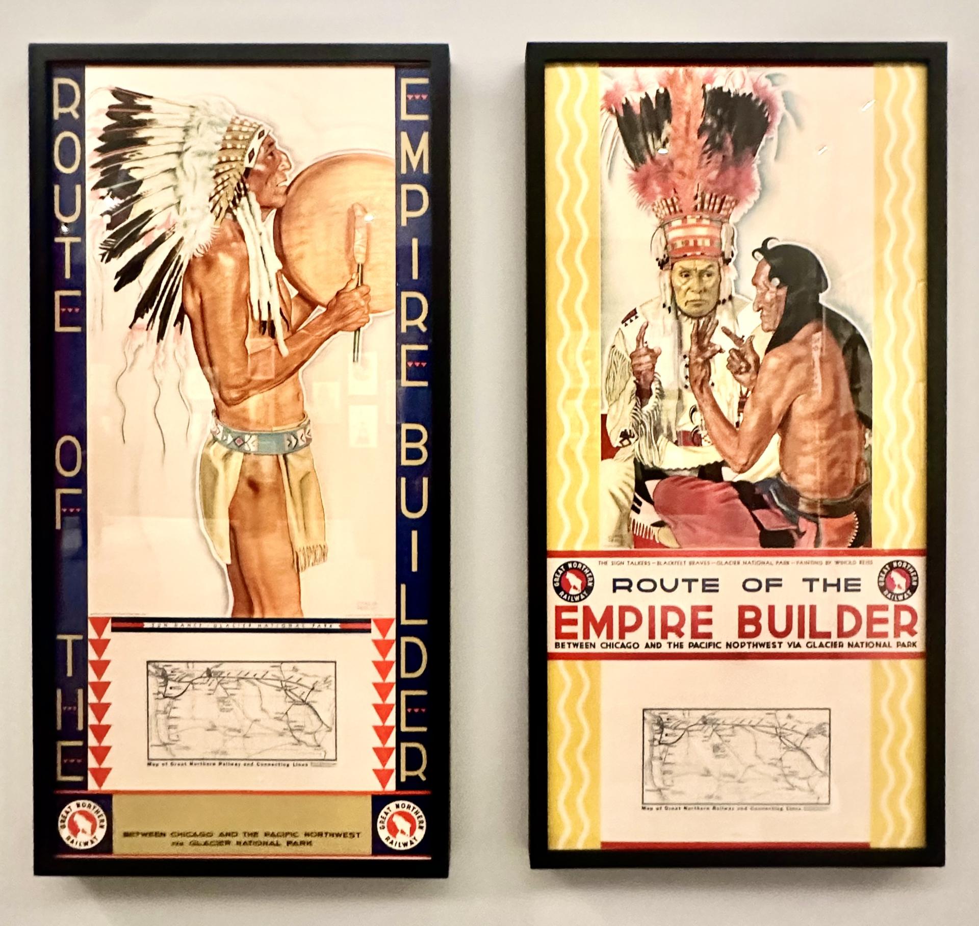
BJ: This relationship started back in 2021–2023 when I gave a poster talk there with Silas for Pride Month. They asked if I'd come back again sometime and give a lecture on Native posters. I said I would, and that I’d want to talk then about their own collection. Once I took a look at it, though, I saw that the examples they had—even while well printed and often aesthetically beautiful—comprised quite extractive works.
CV: Did they not understand what they had? What kind of offenders are we talking about here?
BJ: The posters they’d previously acquired had been chosen primarily for their historical prominence and their monetary value—like their Santa Fe railroad posters, for example. They had the famous “Crying Indian” poster, as well as the Guinness ale ones. Others were chosen because they—purely from a design standpoint—just looked interesting. I stressed to the museum that none of these had actually been made by Indigenous artists.
CV: How did they take your critique at the time?
BJ: Well, I gave this lecture, and when I was done, Chief Curator Angelina Lippert approached me and said, “That was one of the best I’ve ever heard! Do you want to curate your own show here?” And I said, "I would love that, but first you’ll have to give me the money to build for you a collection of real Native works." She agreed.
CV: Was that your only demand?
BJ: I also told the museum that I’d like the show to happen when it would attract the most high school students—especially the Native ones who most needed to see they deserve to be in that space. We agreed on doing it in 2026, and so I had three years to work with them to build this collection.
CV: How did your search come together and what criteria did you prioritize for your selections?
BJ: I searched through the Newberry Library collection, the IAIA [Institute of American Indian Arts], and the National Museum of the American Indian, for example. Meanwhile, many of the posters I was interested in were pieces one could still find on eBay for like 50 bucks. I set out to find historic things, going decade by decade, from the ‘60s, ‘70s, and ‘80s especially.
CV: What was it about the work from those years that you found especially compelling and important to include?
BJ: I had always loved the design aesthetic of the Chicano Movement and the Black Panther Party newspaper, for example, and I hoped to include comparable pieces that represent our Native design history, our publications, our posters—which no one in the design field had really been talking about, as far as conversations on that era. I made it my task to go and find these works.
Fortunately, Poster House Museum really leaned into my recommendations with care and support, in an ongoing conversation. Once I amassed all of the works I’d had in mind, I started to see how to delineate among them.
CV: Please highlight some specific artists and works across the key sections of the exhibition.
BJ: In terms of specific pieces across these sections, I’d like to note the work of Anna Tsouhlarakis, a friend of mine who really inspires me as a graphic designer. I approached her and said, "Hey, I love your billboard works; their compassion and their sarcasm—especially because they use Helvetica Bold." We started to get to know one another, and when I mentioned that I’d love to have her in the show, she was happy to let us print one of her pieces.
Along with all the historic works, the show features important contemporary works by highly visible artists like Jeffrey Gibson. They're just so vital, showing Natives looking at and reacting to popular culture. I knew Jeffrey's work, and since he loves collaborating, I sought to show him in collaboration, sharing with other artists.
Next, there are the posters produced by the IAIA in tandem with the U.S. Census Bureau from 1989–1990 to get Natives to register in the census and have their numbers correctly counted, so there’s accurate data around populations, needs, and representation. Right behind those is a poster by Kevin Coochwytewa saying “I VOTE!” from 2016, emphasizing how important it is for Native Americans to have our voices heard.
Right by that, I put a Haudenosaunee wampum belt.
CV: What is its role there?
BJ: Well, this is where I started to push with Poster House. I explained to them that, as I see things, wampum belts are a kind of poster—but one presented in a different vehicle. I don’t believe that a poster has to be something printed on paper. It can be beaded and shown and worn. The inclusion of a wampum belt is intended to show that Indigenous visual and vernacular languages are just as important as the Latin alphabet.
Imagine a declaration between two tribes—each speaking a different language—and the wampum belt existing as a diagram that says a lot—showing, for example, two parallel rivers that don't impact each other—without using a single word in lettered form.
CV: Decoupling the common understanding of “posterhood,” if you will, from the standard ink-on-paper form is a bold notion. In your sense of things, what even is a poster then?
BJ: It’s a vehicle of knowledge transference. A poster is not a book, but you do the same thing with it: you read it. We are still being colonized to say “This is the only way to take in information,” but expand your brain, I say.
CV: How does this then link to the works spotlighted in the Creative Sovereignty section?
BJ: Creative Sovereignty features the Navajo dye chart, which speaks to the idea of posters as “informational diagrams.” The charts present traditional ecological knowledge (TEK), showing the variety of plants used to dye wool and cotton. Putting this right beside the wampum belt was intended as, you could say, a one-two punch.
CV: Speaking of punches, the Resistance and Protest section reveals the power in images harnessed as tools for the fight.
BJ: When you come to the Akwesasne Notes newspapers and publication house—they put out so many pamphlets, posters, newspapers, and really good books. It boggles my mind that no one is really teaching about these as an actual learning device for and about Natives and our histories.
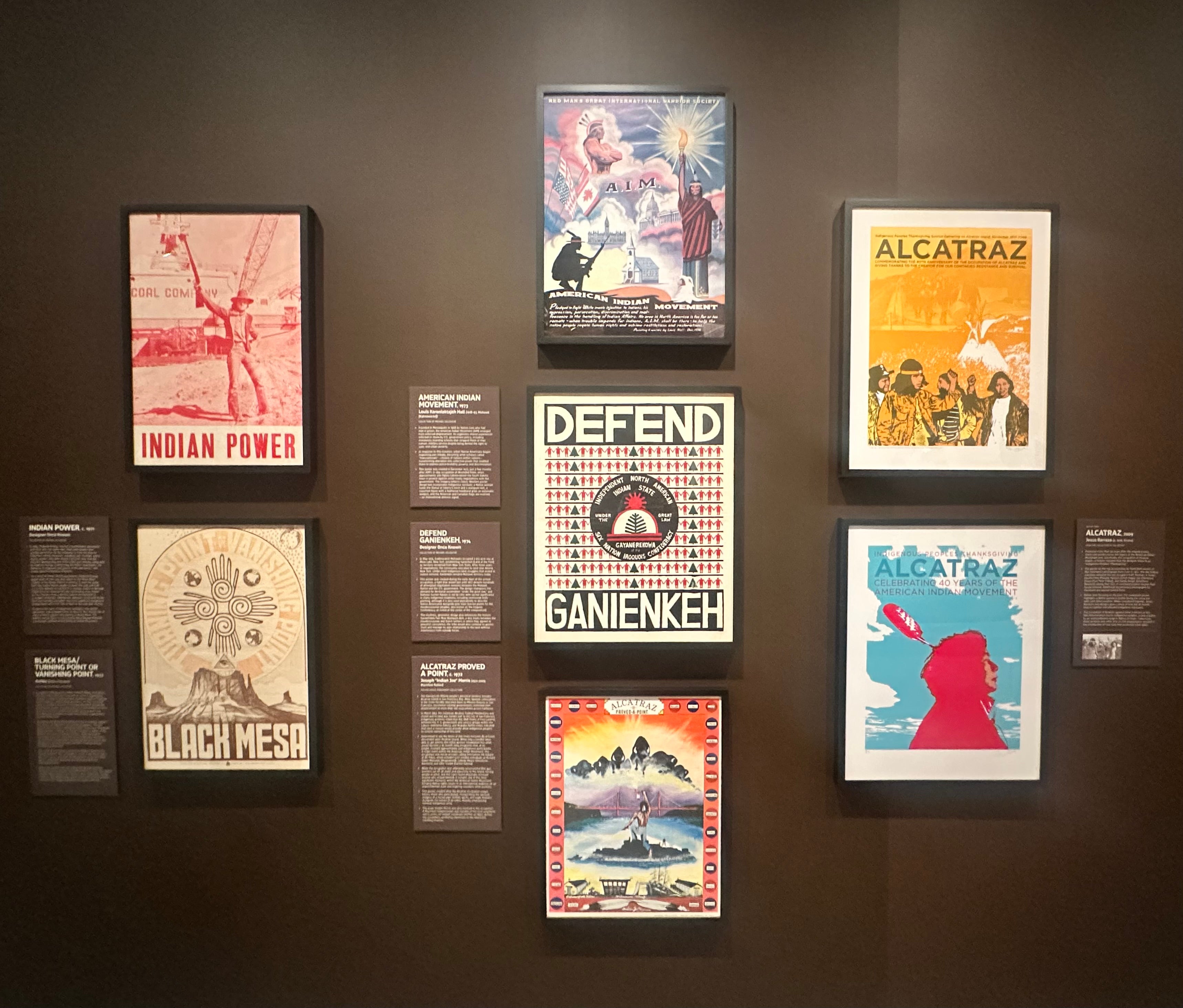
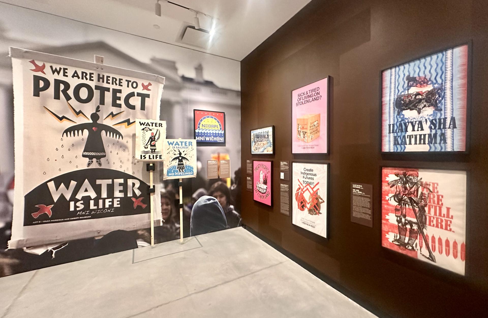
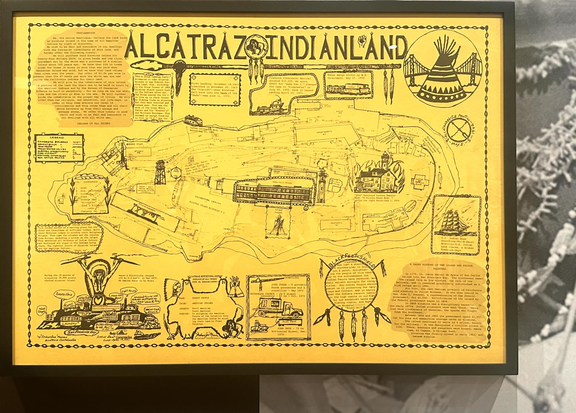
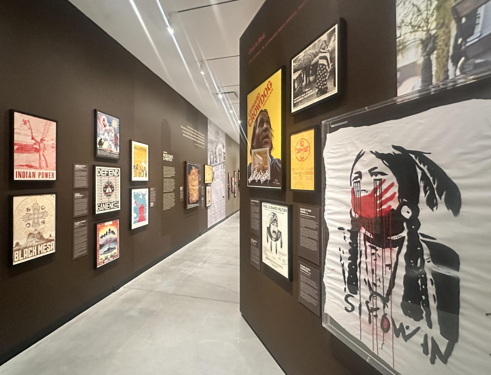
The Red Power era and the American Indian Movement existed and traveled in tandem with other groups in the Civil Rights movement. This section presents the first major modern moment in our movements: the Occupation of Alcatraz, featuring the poster representation of the “Proclamation to the Great White Father and All His People,” using humor and satire to really give it to America. The exhibition then moves all the way forward to the Standing Rock movement there, showing that Native protest has not stopped. Things are still not okay.
CV: In this age of social media, why do you think physical posters retain such vitality and importance?
BJ: I think we have to do both. We still crave physicality, to feel and hold what we make and what has been made. I look for #Native or #NativeAmericanPosters on social media to see what people are making and sharing.
CV: Has it helped you learn about and connect more to the artists making posters, too?
BJ: Yes, that's how I got to know about Lauren Siyowin Peters and her Murdered and Missing Indigenous Peoples posters—because she is, as so many Gen Z'ers are, so attuned to both the local and the social to broaden visibility. My friends in Southern California would see her posters in Santa Monica or Venice Beach and send pics asking, "Do you know who designed this?” So I reached out to her.
We have to go back to really designing and inspiring each other in our own local communities, as well as stepping out into other worlds. I have a very particular understanding of things as a Native that grew up in Virginia, not in California or the Pacific Northwest.
I'm like, here is a drop in the sea of what Native American poster and design can be. Help me find more so I can honor them and say, "Cool, help me make more." Since I have the privilege, the soapbox, and the access, I hope what I share can be a starting point to open up all these different tendrils and continue this weaving to become bigger and bigger.
CV: Will there be a continuation or tour for this exhibit?
BJ: Yes, the American Federation of Arts is going to tour it for at least two years after it leaves Poster House. I want to see it in Oklahoma, in Chicago, in Oakland, going up to Alaska and over to Santa Fe—where the Natives are. Wherever it travels, if there’s a Native population or archive nearby, I especially hope to find locally-made posters to put up and expand the show so anyone can see them and feel, "I sit in relation to this.”
*“Designed to Be Red: Native American and Indigenous Poster Works,” will be on view through February 21, 2027 at Poster House Museum in New York.
--Cristina Verán is an international Indigenous Peoples-focused researcher, educator, advocacy strategist, network weaver, curator, and mediamaker. She was a founding member of the United Nations Indigenous Media Network and the UN Indigenous Language Caucus. As Adjunct Faculty at New York University’s Tisch School of the Arts and Affiliate Faculty of the NYU Center for Latin American and Caribbean Studies, she brings emphasis to the global histories, expressions, and socio-political impacts of Indigenous contemporary visual and performing arts, design, tech, media, and popular culture(s).
All photos by Cristina Verán, unless noted.